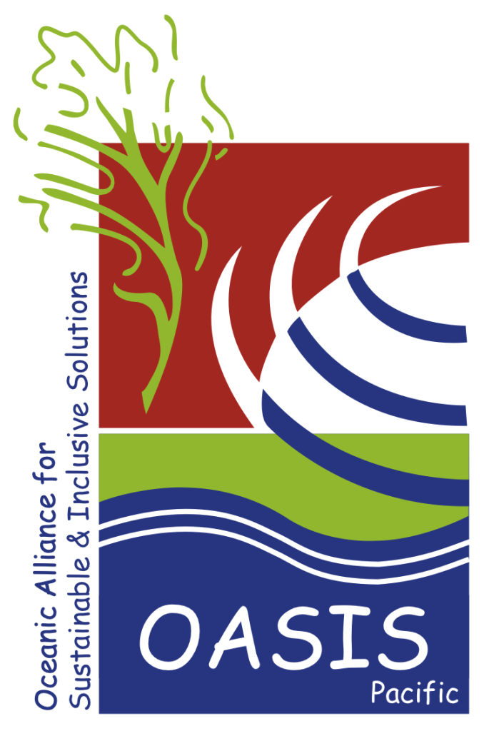
The logo chosen to represent OASIS Pacific is not a brand-new symbol created from scratch.
It comes directly from our collective history — it is the original logo of EMR, the environmental consulting firm founded in 2006 and the foundation upon which our approach was built.

This stylized emblem carries rich environmental and human meaning:
🌞 The sun – source of life and energy
💨 The wind – a symbol of motion and transition
🌱 Fertile land – rooting us in the local context and its vitality
💧 The water lines – evoking both natural resources and access to drinking water
🌊 The ocean and waves – representing island territories and ever-present water
🌳 The tree of life – a thread of growth, regeneration, and resilience
🟥 The red background – evoking the mining soils typical of the Pacific, and symbolizing a reconciled relationship between resource extraction, environmental care, and the transition to more sustainable and circular practices
Beyond its graphic composition, this logo carries deep emotional value: it represents over 20 years of fieldwork, of projects led across Pacific islands, and of trust built with local partners.
It also reflects a long-term vision: the same ecological and territorial transition that OASIS Pacific now champions was already embedded in the DNA of EMR from its earliest days.
By adopting this logo, OASIS Pacific embraces its founding legacy while giving it a new, collective dimension. It becomes a symbol of continuity, recognition, and legitimacy — much like the link we seek to build between companies, projects, and the island territories we support.